

Piotnet Tabs Element (Tabs Widget) empowers you to add any information you desire in separate tabs, you can add as many tabs as you need. The tabs element saves space on your Bricks WordPress Websites and also encourages interactions with your visitors.
This feature can be added directly using a text editor, or you can use an existing Bricks Builder Template.
Demonstration of Tabs Element
Example for first tabs element: Lorem ipsum dolor sit amet, consectetur adipiscing elit, sed do eiusmod tempor incididunt ut labore et dolore magna aliqua. Ut enim ad minim veniam, quis nostrud exercitation ullamco laboris nisi ut aliquip ex ea commodo consequat. Duis aute irure dolor in reprehenderit in voluptate velit esse cillum dolore eu fugiat nulla pariatur. Excepteur sint occaecat cupidatat non proident, sunt in culpa qui officia deserunt mollit anim id est laborum
Example for second tabs element: Lorem Ipsum is simply dummy text of the printing and typesetting industry. Lorem Ipsum has been the industry standard dummy text ever since the 1500s, when an unknown printer took a galley of type and scrambled it to make a type specimen book. It has survived not only five centuries, but also the leap into electronic typesetting, remaining essentially unchanged. It was popularised in the 1960s with the release of Letraset sheets containing Lorem Ipsum passages, and more recently with desktop publishing software like Aldus PageMaker including versions of Lorem Ipsum.
Example for third tabs element: Sed ut perspiciatis unde omnis iste natus error sit voluptatem accusantium doloremque laudantium, totam rem aperiam, eaque ipsa quae ab illo inventore veritatis et quasi architecto beatae vitae dicta sunt explicabo. Nemo enim ipsam voluptatem quia voluptas sit aspernatur aut odit aut fugit, sed quia consequuntur magni dolores eos qui ratione voluptatem sequi nesciunt. Neque porro quisquam est, qui dolorem ipsum quia dolor sit amet, consectetur, adipisci velit, sed quia non numquam eius modi tempora incidunt ut labore et dolore magnam aliquam quaerat voluptatem. Ut enim ad minima veniam, quis nostrum exercitationem ullam corporis suscipit laboriosam, nisi ut aliquid ex ea commodi consequatur?
Detailed Tutorials to create a Tabs Element
Step 1: Pick a Tabs Element
In the Bricks Panel, search “Piotnet Tabs element“, and drag & drop it to the Editor Area.
Edit this widget,
There are two main parts: “Content” and “Style Tab”.
Click on the “Content/Style Tab” to customize your options:
Step 2: Detail Content Tab
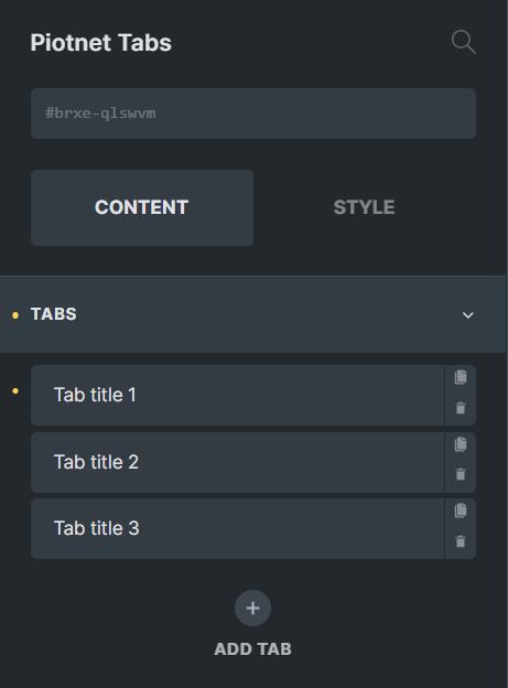
2.1 Tabs
Click on “ADD TAB” to implement your parts.
The number of tabs is not limited, no matter how many tabs are added.
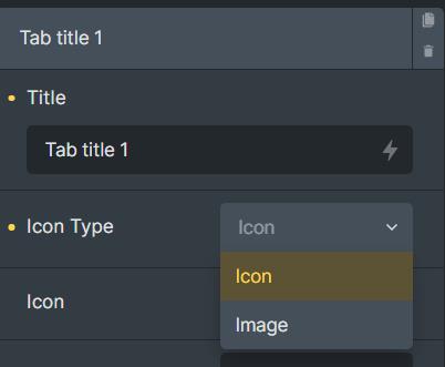
- Title: Select a title that will be displayed at the top of the tab.
- Icon Type: Select the icon types that match your needs, you can choose an icon or image format.
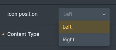
- Icon position: Left or Right align
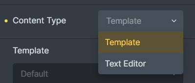
- Content type: Text Editor or Bricks Template
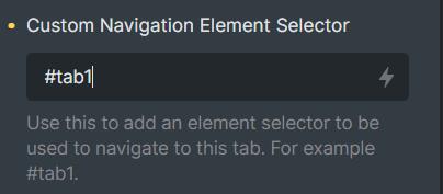
- Custom Navigation Element Selector: as an ID of the tab, you can link another element that you want to navigate to this tab.
For example, #tab1 (hash is mandatory – please make sure that IDs are inserted with the hash ‘#’.)
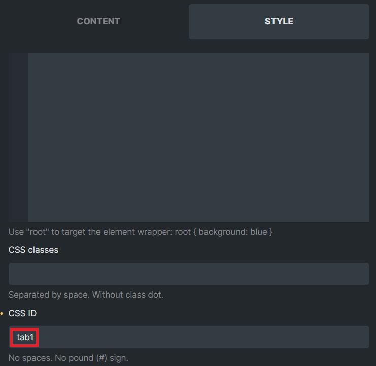
After that, you just need to implement that combined element to navigate this tab.
Go to Style > CSS > CSS ID and add CSS ID for that element.
For example, tab1 (different from the above format – please make sure that IDs are inserted without the hash ‘#’)
Now, Piotnet Tabs will be navigated using any Bricks elements that you’ve assigned a CSS ID to it.
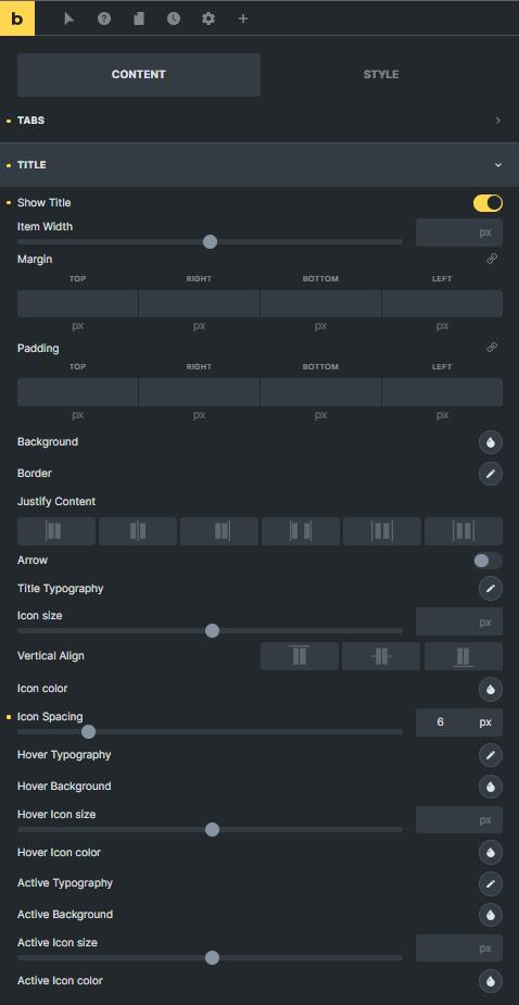
2.2 Titles of Tabs Elements
In this part, you can configure the layout and style of Title Tabs Element
When using Custom Navigation Element, you are able to hide the Title Tab.
In addition, you can customize the typography, spacing, background, color, border, and size for Titles and single icon
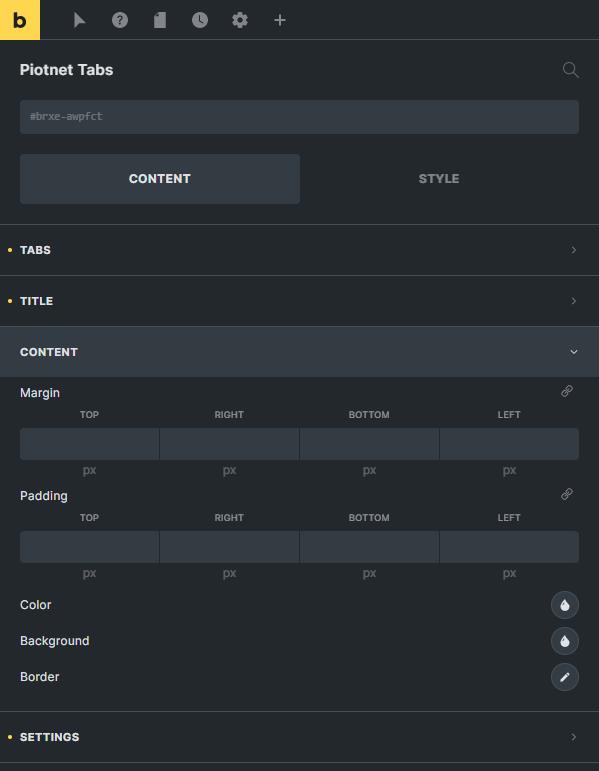
2.3 Content
You are able to easily configure the Color, Background, and Border of Contents.
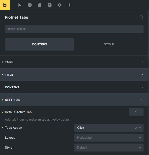
2.4 Settings
- Default Active Tab: Add tab index to make a tab active by default. The index begins from 1.
- Tabs Action: There are two options Click and Hover
- Layout: Horizontal or Vertical method
- Style: Default or custom choices.
Step 3: Detailed Style Tab
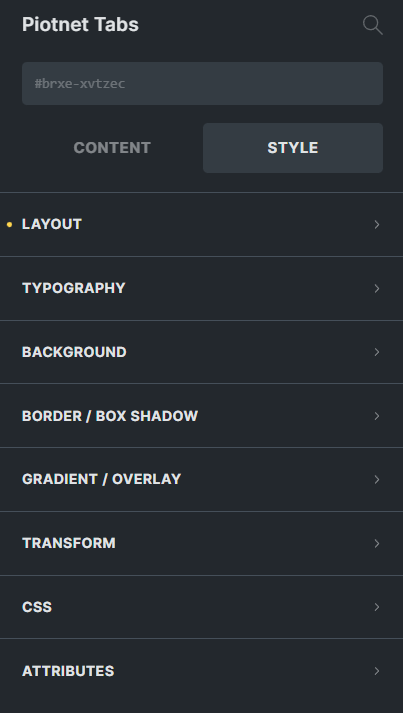
Controls under the STYLE tab affect the style/design (CSS) of a block and are grouped into:
3.1 Layout
Spacing:
- Margin: Set the space between the tabs.
- Padding: Set the space between the tab title and the edge of the tab.
- The margin and padding can be declared using pixels, %, or em. You can link the values together, or only change the value for one side of the tab.
Sizing: Customize the width or height of Tabs
Flex: Adjust the align types.
3.2 Typography
Adjust the font settings.
3.3 Background
Background Color: Select a background color for the description.
Select Image: Choose a specific image for the background
3.4 Border/Box Shadow
Border: adjust the Width, Style, Color, and Radius of the border.
Box Shadow: Add a box shadow around the tab description. You can choose the color, position, and effect.
3.5 Gradient/Overlay
3.6 Transform
3.7 CSS
The place to customize CSS
3.8 Attributes
Related Features
Recommendation:
To diversify query or apply filters, you can refer to Piotnet Grid. It possibly fulfills your advanced Grid Layout or combine Facets to filter Bricks Query Loop.