

Application for any Bricks/other platforms Elements
Tooltip, as infotip or hint. When hovering over a screen element or component, a text box displays information about that element, such as a description of a button’s function, what an abbreviation stands for, or the exact absolute time stamp over a relative time (“… ago”).
Demonstrations of Tooltip

hover to this heading
Detailed Tutorials
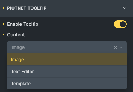
Click on any element > Style Tab > Enable Piotnet Tooltip
Then choose a Content format (Image/Text Editor/Template)
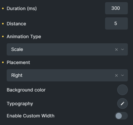
Customize the relevant parameters: Duration (ms), distance, Animation type, Placement, Black ground color, Typography, and Custom Width.
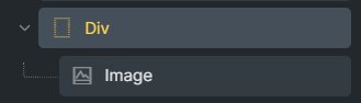
A note for Image/Icon elements.
Because different systems and the Image/Icon elements have unique constructions, a covered div is required with these elements.
Click on that div > Style Tab > Enable Piotnet Tooltip
Related Features
Recommendation:
To diversify a form, you can refer to Piotnet Forms. It possibly fulfills your advanced and complicated setup requirements for building a form.
For instance: Apply Payment methods, multiple Marketing and other platform integrations, etc.