Made by Bricks Element Creator (Widget Creator)
Instead of manually animating buttons with CSS, you may just drag & drop numerous button animations with these eye-catching and “flashy” hover effects.
Demonstration of Animate Buttons
Detailed Tutorials
Trigger Bricks Element
In the beginning, you need to add this element to Element Creator Category from the demo list.
Access “Add Element Creator” > Hover on Button Animation
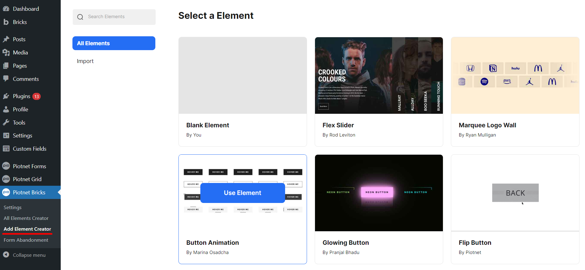
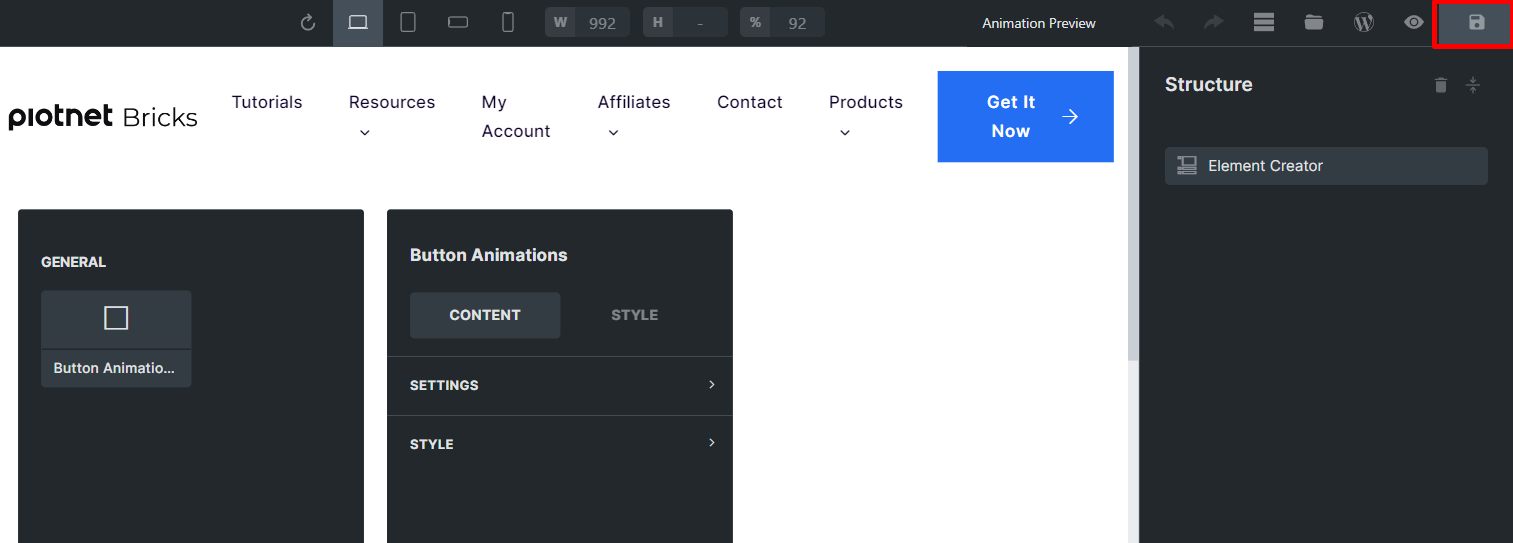
After that, it directs to the Button Animations Editor > click on “Save it” to trigger this element.
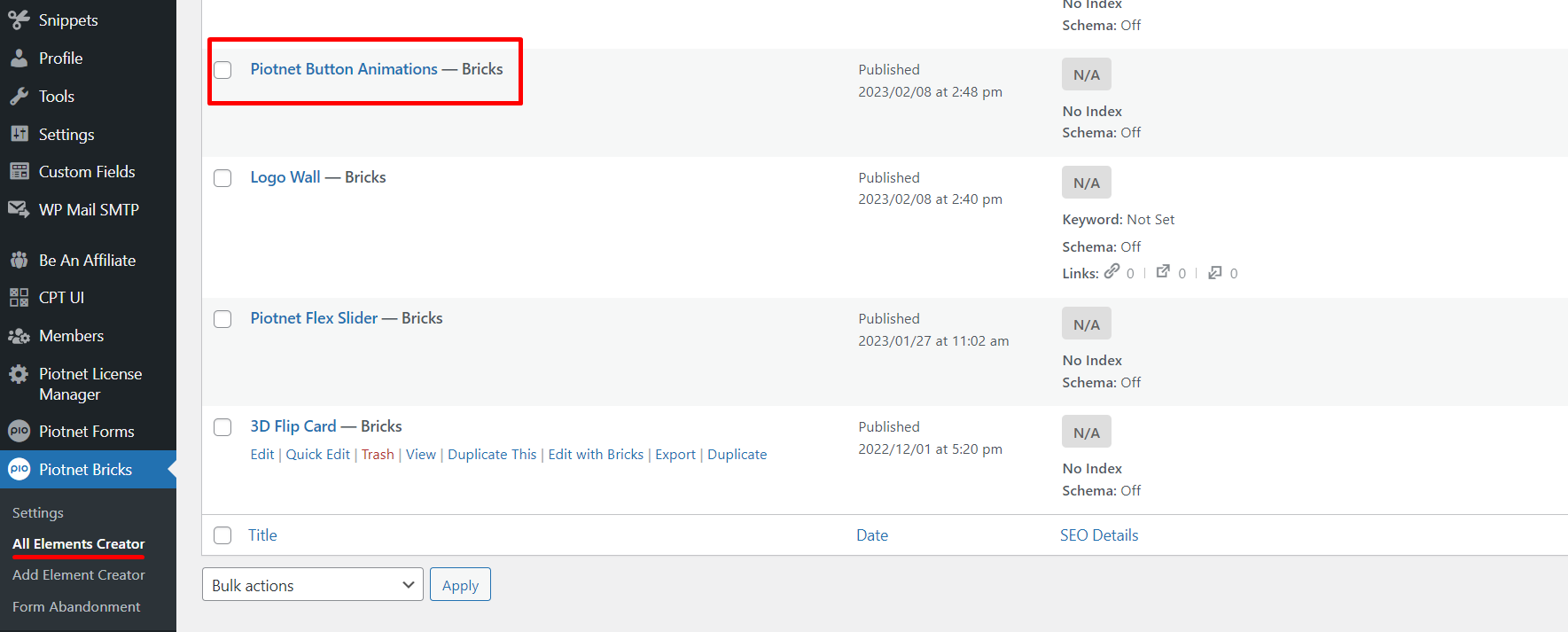
This element will be stored in “All Elemen Creator” as well.
Configure Element Controls
There are two main controls in the Content Tab:
- General Settings
- Style
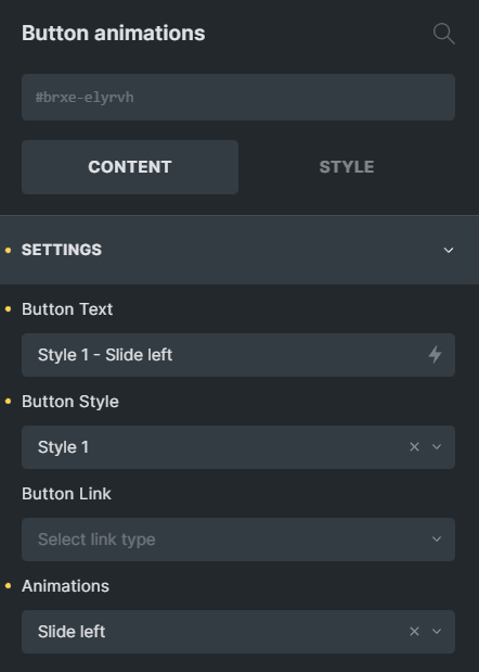
Settings Control
- Button Text: the Title of Buttons
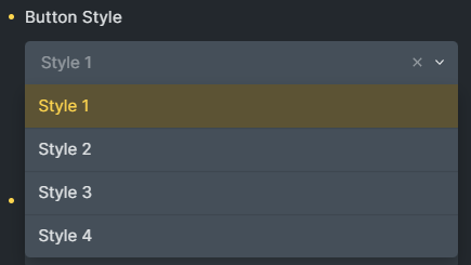
- Button Style: there are 4 available Styles (you can check the demos above)
- Button Link: you can embed your URL here.
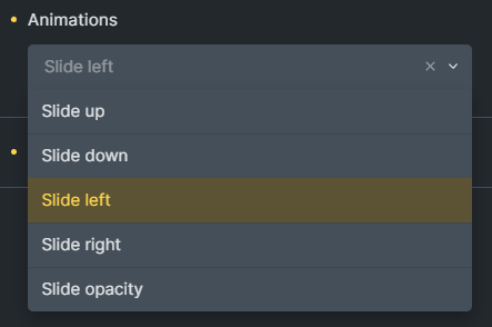
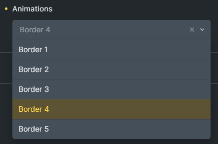
- Animations: there are 10 hover effects.
Style Control
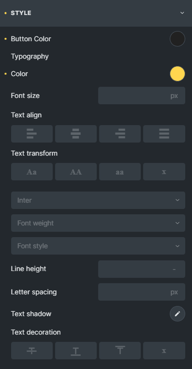
You are able to customize the Color of Buttons or Typography’s relevant parameters, such as: Color, Font Size, Align, etc.
 Skip to main content
Skip to footer
